
UNITED AIRLINES
Merging 30+ tools into one central experience for flight attendants

OVERVIEW
United Airlines flight attendants were juggling over 30 separate apps to manage in-flight tasks, customer service, and compliance—resulting in inefficiencies and a fragmented user experience. Our cross-functional team partnered with United to design a unified, intuitive platform that streamlines daily workflows and aligns with key business needs.
Our north star was clear: put flight attendants in control by designing tools that support the rhythm of their work, not disrupt it—enabling them to lead each flight with greater ease, confidence, and care.
DETAILS
A 12-week discovery and design sprint blending Design Thinking and Agile to define a user-centered product vision. We delivered research insights, journey maps, personas, product flows, a high-fidelity prototype, and a prioritized roadmap with a 3-sprint launch plan.
Core outputs included:
Competitive research
User testing guide + synthesis
Journey map + personas
Product flows (w/ feature mapping)
High-fidelity prototype
Roadmap + sprint plan
ROLE
Role: Embedded Design Director, leading a cross-functional team of 5 designers across product, content, and service design
Services: Design leadership, product strategy, service design, cross-functional team facilitation, experience mapping, and high-fidelity UI design for mobile platforms
IMPACT
After 3 months of workshops, focus groups, and concept exploration, we delivered a detailed app architecture and 27 high-fidelity wireframes — laying the foundation for a unified app experience and future development roadmap.

Discovery
The project was kicked off with business stakeholder interviews, group interviews with flight attendants, and a 3-day workshop to collaboratively define the end-to-end user journey and establish foundational insights.
By the end of the week, we left with:
A shared understanding of the user journey
A prioritized list of user needs and business goals
Concept sketches for the integrated platform

Collaboration and Ideation
End-to-End Journey Map

Mapping the Journey
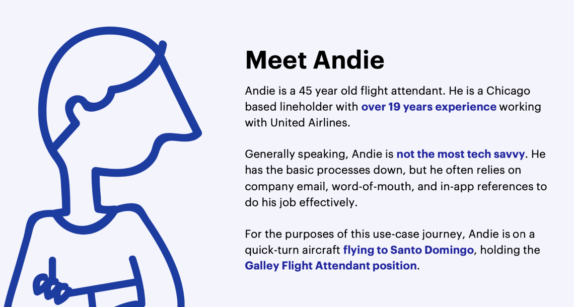
We defined our user persona to keep ourselves focused on the moments that matter the most when diving into the user experience.
Defining the
Primary Persona

Hero Path (Ideal State)
We then identified the “hero path”, otherwise known as a golden or happy path. We used these points in the journey to align on what screen or section within the new app would be the best place to explore the user requirements and design against their needs in that moment.
Product Flow
We took the 8 apps and mapped the features and content at a high level to the future vision of the Link App. From there, we focused on the creation of a product flow, with the intention of mapping all concepts, features, and prioritized user stories into a unified app experience for the flight attendants.
Feature Mapping Product Flow
Simplified Product Flow

User Testing
We set out in the first round of user testing to understand if the current navigation, design patterns works with their working mental model. We also wanted to assess the perceived value of the designs.
After testing with 11 FAs individually, the team also conducted a card sorting exercise with the FAs to further pressure test the navigation structure.
Most flight attendants found a lot of positive value in having all of their tasks and resources accessible from a single location. However, people had differing opinions when it came to guessing where certain things could live throughout the app. To accommodate their needs, we created a structure that supports them by providing contextual information context.


Wireframes
We took high fidelity wireframes to leverage as a prototype in user testing session with flight attendants and focus group interviews to test the user experience for MVP.


A closer look at the details…
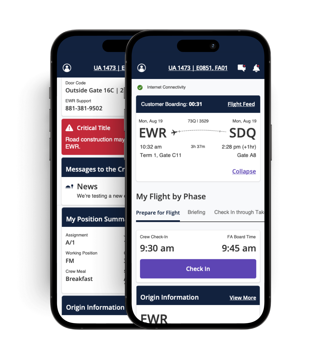
FLIGHT BY PHASE
From customer check-in to deplaning, and everything in between, users are able to view different tasks, tools, and resources based on what standard phase of the flight they are in.

TASK-BASED FLOWS
During interviews, flight attendants emphasized the importance of the tasks they’re assigned and the order in which those tasks are completed. For this reason, we prioritized a check-list interface to help users stay grounded in the flurry of tasks they have to complete.
FLIGHT TOGGLE
Flight attendants are not only given access to their current flight, but they can quickly toggle to the next leg of their flight.
FLIGHT DETAILS
Users are shown a quick snapshot of the flight details, including departure and destination information; the idea is that this would mirror what customers can see in their United Airlines guest app.
NAVIGATION
While the homepage is designed for all critical information needed at each moment, flight attendants can also navigate to aircraft details, service and supply inventory, and customer information.


Outcome
Orion is United’s product design system that was previously created, which would be leveraged to define the visual design for the United Link App. What you see to the right is an interpreted example of how Orion was recommended to be applied to the wireframes as they exist in their current state.
Today, to our team’s knowledge, United Airlines flight attendants are using a single source of truth for their flight-to-flight tasks thanks to this engagement.